How to Meet Users Where They Are: A ‘Quality’ Case Study
- Nabilah Noorani

- Nov 1, 2022
- 3 min read
Updated: Jul 21, 2025
This is the second article in our series about ‘Designing for Access’.
Gramhal has run several experiments since its inception. One among these was a crop quality service offered to farmers at their doorstep. Crop quality is one of the most important factors that traders use to determine offer prices to farmers for their produce. Given the imbalance in the power dynamic, traders often use unscientific methods or change the readings in their personal devices to manipulate the crop quality, quote a lower rate, and cause farmers to lose fair income.
With the testing kit developed by Gramhal, rural micro-entrepreneurs would visit farmer houses and conduct crop quality inspection. They would offer a receipt in return that marked the crop at different quality parameters.
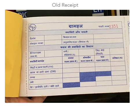
Initially, the team recreated the quality receipt to look similar to the ones used by traders (see image below). This receipt contained many numbers and data points, including some that were unnecessary. More importantly, an average farmer did not understand the significance of the indicators or what they were marked at.

For instance, farmers would not understand what 12.6% moisture indicated. Did it mean the grain quality was good or poor? To them, it was just a number. What was clearly lacking was the ability to interpret and then communicate accordingly. They lacked the means to contextualize the information to their situation and then use it to their advantage.
To solve for this, the crop quality receipt was redesigned using a human-centered approach.

First, it was decided to only include information that was necessary and relevant to the farmer. This involved getting rid of data points that didn’t serve the farmer.
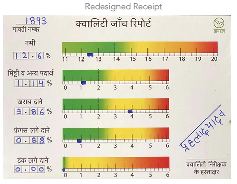
Next, the receipt used scales instead of just numbers to make it easy for the farmer to understand where their crop’s quality stood as compared to the quality standards for every crop. For instance, the higher the moisture, the further it would be ranked on the scale.
Colour-coding the scale across a green-to-red gradient from left to right made it even easier to understand the quality indication. It also offered the scales a better visual appeal. The logic behind this was simple colour association. Let’s take traffic lights for consideration—we know red is a hard stop, green is to go, and yellow advises caution. The team extended this universal colour symbolism for farmers, particularly in the crop quality context. If the pointer for ‘bad grains’ or ख़राब दाने landed at 6 on a scale of 0–6, it would be in the red zone. This would indicate, at one glance, that the quality of their grain is poor. They would accordingly set their price expectations when entering negotiations with the trader.
Finally, the receipt used a gradation format instead of distinct colour intervals of what signified good or bad. This was intentionally designed in lieu of a lack of industry standards. By arranging the colours across a gradient scale, we ensured that farmers were aware of their crop’s quality without proclaiming hundred percent finality.
The biggest outcome of this design intervention was that it gave farmers the ability to understand their crop’s quality first-hand. The new receipt was more suited to their context and brought them closer to interpretation by a huge margin. More tangibly, it allowed farmers to negotiate better—for fair prices with traders—or make more informed decisions, such as to store their produce or search for a different trader.
The new crop quality receipt thus became a powerful tool to empower farmers. The receipt moved from being intimidating to one that championed interpretation. Here, upholding ‘design for access’ as a guiding value grounded the team at Gramhal to innovate for the overlooked and underserved. It always starts simple—by meeting users where they are and empathising with their context.
Cover image source: Image by <a href="https://www.freepik.com/free-vector/hand-drawn-india-lifestyleillustration_31752215.htm#query=farmer%20illustration&position=0&from_view=keyword">Freepik</a>


Comments