UX design reflections: Reimagining the imagined
- Ayanima

- Oct 13, 2022
- 4 min read
Updated: Mar 11, 2024
Numeric Code Poster Design for Agricultural Markets of Central India.
At Gramhal, we understand that design thinking is a non-linear process. It may start as a linear framework, but it involves a lot of back and forth between those process stages. Only then does it reach a point where most of the user journeys are catered to. Hence, it's vital to keep iterating our design interventions from time to time.
With our users as the farmers and rural households of India, understanding their needs and user experience while using the product is primal. The process starts right from defining their problems and figuring out the loopholes to gradually empathizing, analyzing, assessing, and ideating to evolve into a seamless user journey. This also helps us to articulate the garnered data for future design referrals.
Pause // Think // Design // Test // Repeat
Our product ‘Bolbhav’ is a chatbot that provides agriculture-related information and support to farmers and rural households.
Being able to provide farmers with localized intelligence and knowledge in the simplest and most universally accessible form possible is one of our core principles.

Currently, we cater to farmers hailing from various districts of — Madhya Pradesh, Rajasthan, and Maharashtra. To provide localized knowledge which is contextually specific, they need to first identify which district they live in. To do this, the chatbot sends them an infographic that contains numeric codes for their districts. We call this a banner.
The banner design is crucial to the user’s successful use of the product. To provide the farmers with a better user experience, we decided to pause, question, and rethink our current banner design. Here are three observations we made:
Less is more
Observation:
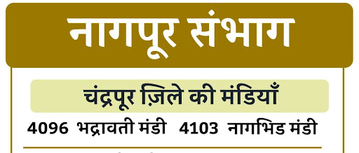
In each banner, every division is divided into districts which are further then bifurcated into markets available in that division. For example, if one wishes to seek the market price code for Bhadrawati, in Chandrapur District in Nagpur city, Maharashtra the visual hierarchy in the banner would be -
नागपूर संभाग > चंद्रपूर जिले की मंडियाँ > भद्रावती मंडी
There are at least 6 divisions that we cater to in every state with multiple districts which have numerous subdivisions for market prices (crops). Within so many markets, naming each market as ‘XYZ मंडी’ crowds the banner and makes the banner seem information heavy.

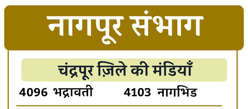

Iteration:
With the title for the district subdivision named ‘ XYZ जिले की मंडियाँ’, the presence of simply the market name (ex. भद्रावती मंडी as भद्रावती) further on in the eye-flow hierarchy makes it spacious leaving an opportunity to increase the font and hence enhance the visibility of the market name in the banner altogether.
Purpose simplified
Initial observation:
In the current design, the numeric codes are positioned right in front of their respective market names, but they fail to highlight themselves in a banner made for the sole purpose of providing the information code. Rather, they camouflage the market names as simple textual matter.

Iteration 1:
For the user to distinguish the codes from the market names while being able to read them both vividly, a ‘box design’ (a rectangular bubble around the text to highlight it) was proposed with interventions like the play of contrasting colours for text, increased font size and distinctions for every market/ mandi name. This helped in ease of locating and distinctly reading the codes for the market names.

In-process observation:
Although the box design worked for easing the visibility, it increased the overall banner size and scale. Hence resulting in pixelation of the rendered image (when the banner was exported and tested on WhatsApp - our chatbot user interface) making it difficult to grasp the market names.
Iteration 2:
The decision to highlight the codes using contrast was carried forward, while the stroked box design around the market names was opted out, giving us scope to increase their font size as well. For distinguishing the names one from the other, the initial design line separation was adopted. This increased the negative space, making it easier to grab attention to the names.

A lesson in usability testing
A byproduct of other iterations:
With our initial iterations in place, every market name and its codes were highlighted via thin stroked boxes and the fonts were increased to ensure better visibility. The frame size was subsequently scaled up and the length was increased to fit all the market names, keeping the initial district structure intact.
Observation:
While doing so, the frame size no longer remained proportional due to which during its’ usability testing on our chatbot UI(user interface), the image had to be scrolled through its’ length and the render quality was reduced. Even the upscaled market name fonts could add only a little to visibility due to frame disproportion.
Iteration:
Re-assessing the design decisions and their impact on the render quality of the banner in our UI, we chose to stick with the core purpose of highlighting the codes and readability of the market names. For that, the frame size was considerably downscaled. The iterations made in the technique used for highlighting the codes i.e. removal of thin stroked box designs resulted in the increase in font size and availability of negative space. Due to this, overall special and scalable adjustments were made possible in the banner for the final composition.


Takeaway
Having constant feedback conversations over the iterations helps in taking better design decisions. Even the tiniest intentional intervention in the existing chatbot flow and the graphic aids helps in bringing about a meaningful impact on a user’s experience while using the product.


Comments